
How to Read Graphs in Math and Science Exams
Graphs are essential for conveying data in a clear and concise way, and you’ll find them in most math and science exams. Whether it’s a chemistry experiment result or a mathematical function, reading graphs effectively is crucial for scoring well. In this guide, you’ll learn strategies, explore interactive tools, and see visual examples designed for high school and college-level exams.
1. Types of Graphs You’ll See on Exams
Understanding the different types of graphs is the first step. Here are the most common ones with examples:
1.1 Line Graphs
Used to show how one variable changes over time. Common in physics and biology to show things like temperature, velocity, or growth over time.

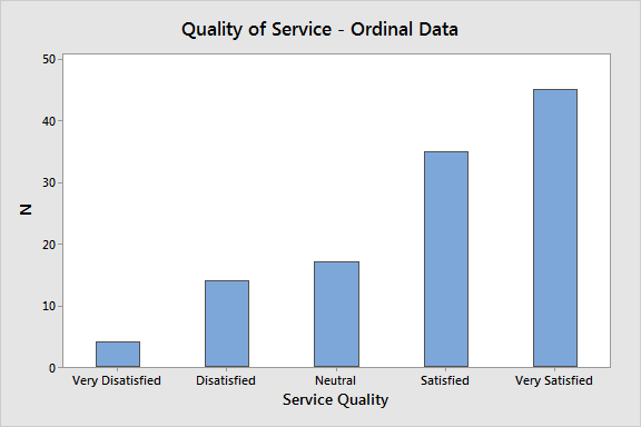
1.2 Bar Graphs
These are great for comparing quantities. Each bar represents a category.
1.3 Pie Charts
Used to show proportions or percentages.

1.4 Scatter Plots
Used to determine relationships or correlations between two variables.

2. Anatomy of a Graph
- X-Axis: Typically represents the independent variable (e.g., time).
- Y-Axis: Represents the dependent variable (e.g., speed, population).
- Title: Describes what the graph is about.
- Legend: Helps interpret multiple lines or bars.
- Scale: Pay attention to how values are spaced.
3. Interactive Line Graph: Temperature vs. Time
Input temperature readings over time to visualize how values change in a modern, interactive chart.
4. Practice Problem Example
Problem: The graph below shows the speed of a car over 10 seconds. During which time interval was the car decelerating?
Solution Tip: Look for a downward slope.
5. Real Exam Tips
- Underline what the question asks before looking at the graph.
- Watch out for tricky scales (e.g., gaps, unequal intervals).
- Estimation is okay if precise numbers aren’t shown.
- Always check the units.
6. Key Vocabulary
- Slope: Steepness of the line (rise over run).
- Intercept: Point where line crosses axis.
- Plateau: A flat section—no change in variable.
- Peak: Highest value reached.
8. Interactive Pie Chart: Category Proportions
Enter percentages for different categories to generate a pie chart showing proportions. The total must be 100.
Also check: How to Interpret Graphs and Charts
Also check: Understanding the Axes: X-Axis vs Y-Axis

